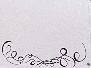
So there is a lot of potential going on here and I've done a mock up for visualization's sake. Firstly here are the sketches. Unfortunately these didn't translate very well and would be clearer if I had used a scanner as opposed to a camera. So, that's the reason they are blurry, not because the images themselves are blurred.
Without further ado: the sketches.
Sketch 5

Sketch 6

Sketch 7

Sketch 8

And then here are the two versions of text. The first is only font #4. The second includes font #2


Now this is the potential it has when combining some of the above factors.


And that's what I've been working on.


No comments:
Post a Comment