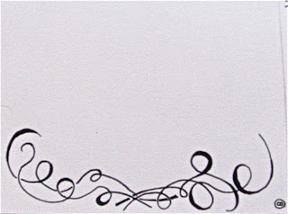
This is without the reception information on it and that will change what this looks like, in that the majority of the type (save for your names) will be smaller.
Here is what I'd like to do for the Thank You cards. Let me know if this is not to your liking. I thought that they would be nice and simple yet elegant and classy. If you don't think this is in line with those definitions or you want something different let me know.
Friday, August 27, 2010
Tuesday, August 10, 2010
Jenny & Jared: Proposition 2
So there is a lot of potential going on here and I've done a mock up for visualization's sake. Firstly here are the sketches. Unfortunately these didn't translate very well and would be clearer if I had used a scanner as opposed to a camera. So, that's the reason they are blurry, not because the images themselves are blurred.
Without further ado: the sketches.
Sketch 5
Sketch 6
Sketch 7
Sketch 8
And then here are the two versions of text. The first is only font #4. The second includes font #2
Now this is the potential it has when combining some of the above factors.
And that's what I've been working on.
Without further ado: the sketches.
Sketch 5
Sketch 6
Sketch 7
Sketch 8
And then here are the two versions of text. The first is only font #4. The second includes font #2
Now this is the potential it has when combining some of the above factors.
And that's what I've been working on.
Friday, August 6, 2010
Jenny & Jared Rough Sketches
Here are some rough sketches of cover designs and illustrations. At this point it is really open ended and I'm hoping for some constructive criticism. I made four designs (some swirly, some a little more concrete) and can take any and run with them or I can scrap them and start anew.
Here are all four of them together for comparison's sake.
Detail of sketch 1
Detail of sketch 2
Detail of sketch 3
Detail of sketch 4
And lastly here is a mock up of how I was imagining the invitation, envelope and business card. We can go a bit more formal than this if you'd like. The front of the card would have an illustration/design (i.e., like those above), and the inside would have the invitation words on it. The RSVP would be one-sided (i.e., no back design, just RSVP info) and simple.
And lastly here are some fonts to be thinking about for the inside of the card. Please pick two fonts of these seven. We'll discuss fonts more in depth later but I wanted to get a feel as of right now.
I hope this is a good jumping off point and I'm looking forward to hearing what your thoughts are on these. :0)
Subscribe to:
Posts (Atom)